x
x
Showing posts with label Ancillary tasks. Show all posts
Showing posts with label Ancillary tasks. Show all posts
Thursday, 28 January 2010
Actual final poster.
Today when we looked at our poster again and showed it to Mr Nicole we made some slight alterations because i felt that ONE OF THOSE DAYS needed to be bigger and more obvious so this is what it now looks like and we just need to print it off to hand in.
x
x
28/01/10
Today's lesson we have shown our final video to Mr Nicole for feedback aswell as our ancillary tasks.
We are happy with the filming and glad that Mr Nicole likes it. Obviously, there are a few errors in the final film because Niall's miming is out of synce to the music but we have done the best we could to get it as good as possible and make sure it all fits well :)
I showed Mr Nicole the ancillary tasks and he thinks that the information in the middle needs to be more spaced out and suggested that I make the title slightly more visible so I have changed it to this:

After showing this one to Niall and Sadie they thought the title needed to be even bigger so I've changed it again:

Also this lesson we want to start filming ourselves answering the evaluation questions.
We are happy with the filming and glad that Mr Nicole likes it. Obviously, there are a few errors in the final film because Niall's miming is out of synce to the music but we have done the best we could to get it as good as possible and make sure it all fits well :)
I showed Mr Nicole the ancillary tasks and he thinks that the information in the middle needs to be more spaced out and suggested that I make the title slightly more visible so I have changed it to this:

After showing this one to Niall and Sadie they thought the title needed to be even bigger so I've changed it again:

Also this lesson we want to start filming ourselves answering the evaluation questions.
Wednesday, 27 January 2010
FINISHED FINAL CD COVER & POSTER, AWH YEAH :)
Today we have been able to get so much media done, our video is very very close to being complete just a few minor tweeks to be done and we have completely finished our ancillary tasks changing it to Niall etcccc.

CD cover: (front, inside and back)
Front:
Inside:
Back:
We added some more tracks to the back of Joel's cd to make it an album rather than a single because now it doesn't look so empty and it premotes more of Joel as an artist.
Poster:
Our first poster design people really liked as it showed our technology skills and was eye catching, but now with the changes in our video we felt it didn't tie in as well. Also it wasn't at all similar to our CD case so the products didn't seem to be helping each other and working in promotion together, so instead of our first design which was this:
We started pretty much completely again and came up with this:

This poster really links in with the theme of our CD cover and is again really eye catching with the big photo of 'Joel' (Niall) he comes across really happy interesting artist, the information is simple and yet effective. When showing the class again, although they had originally liked our poster before they agreed that this tied in really well and looked proffessional.
x
Finally :)
All the ancillary tasks are completed and edited so we are very happy with them.
We only have a tiny bit left of editing for our music video and then we will make any final changes to it if we need to, such as tweaking here and there to make sure the timing is perfect as we have had some trouble with the timing of Niall's miming to the music. We have used shots of Niall singing to each verse infront of different backgrounds which we shot at my house the other day and during instrumental breaks or to fill in the gaps between verses, we have used black and white shots to represent Niall's thoughts and flashbacks which we filmed outside.
We are really pleased with how much we have got done today and I'm glad we gave up so much time to get it all done. We now need to focus on finishing the video and filiming our evaluation :)
We only have a tiny bit left of editing for our music video and then we will make any final changes to it if we need to, such as tweaking here and there to make sure the timing is perfect as we have had some trouble with the timing of Niall's miming to the music. We have used shots of Niall singing to each verse infront of different backgrounds which we shot at my house the other day and during instrumental breaks or to fill in the gaps between verses, we have used black and white shots to represent Niall's thoughts and flashbacks which we filmed outside.
We are really pleased with how much we have got done today and I'm glad we gave up so much time to get it all done. We now need to focus on finishing the video and filiming our evaluation :)
Editing.
Our film is very nearly finished being edited it is just the last verse that hasn't quite been done. This is because someone else needed our mac but it's so nearly finished and has gone really well, I added some black and white parts as memories and linking to the story line of the song. Tomorrow we just need to finish the very last part and it should be as easy job cos i know the shots i'm going to use they just need to be synced and then add the titles at the start. Whilst i was editing Daisy was changing our original designs from Joels CD cover to the one with Niall as Joel using the pictures we had taken earlier, all our ancillary tasks are done now and we have decided together on our final drafts and definite idea's so now for our evaluation. :)
x
x
Ancillary Tasks 2
After creating a possible design for the poster I also added some made up tracks onto the back of the album cover to fill in the blank space so it doesnt look as empty.
I have chosen a large, cheerful image of Niall and blended it into the background for the poster. I chose this image because I think it is a really nice photo and will appeal to our tagert audience by catching their attention and I think the way he looks captures his youth well which represents our target teenage age group.
Here is the new back cover design:

Here is the poster design:

I then decided that the title of the album should be bigger to grab attention and I changed the colour of the text in the middle to a grey so there was some variation in colour scheme:

P.S One last change:

I added a bit more information onto the poster to sell the album more and make it look more professional. I did this by adding how much the album will cost and where you are able to buy it, I havent made the album too expensive as we are targetting a younger/teenage audience and therefore expect many of them to have student loans from being at University or just generally unwilling to spend alot of money on an album when you can download them on itunes or illegally on the internet now.
I have chosen a large, cheerful image of Niall and blended it into the background for the poster. I chose this image because I think it is a really nice photo and will appeal to our tagert audience by catching their attention and I think the way he looks captures his youth well which represents our target teenage age group.
Here is the new back cover design:

Here is the poster design:

I then decided that the title of the album should be bigger to grab attention and I changed the colour of the text in the middle to a grey so there was some variation in colour scheme:

P.S One last change:

I added a bit more information onto the poster to sell the album more and make it look more professional. I did this by adding how much the album will cost and where you are able to buy it, I havent made the album too expensive as we are targetting a younger/teenage audience and therefore expect many of them to have student loans from being at University or just generally unwilling to spend alot of money on an album when you can download them on itunes or illegally on the internet now.
Ancillary Tasks
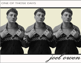
Below are the images of our front, inside and back cover for the album:

Whilst Sadie looks through our filming and does some more editing I am going to try and come up with a design for the poster which so far I have changed to follow the theme of the rest of our ancillary tasks.


Whilst Sadie looks through our filming and does some more editing I am going to try and come up with a design for the poster which so far I have changed to follow the theme of the rest of our ancillary tasks.
I have got rid of the image we had of Joel when we were creating draft poster designs so that I can start from scratch. This is the design layout so far but I'm sure it will change:


Album Cover
We picked our favourite image from the photos that I took of Niall today and used the same design as we used for Joel for the album cover.
This is the design we made of Joel to begin with:
This is the design we made of Joel to begin with:

I then replaced the images of Joel to images of Niall instead:

After looking at this design we liked it at first but I wasnt sure if we had used the best image we could so I got some class feedback from other media students that are staying behind and decided that this design was better because it had more of an edge to it and would appeal to our target audience more.
Here is the final design:
Back Cover designs - JOINT BLOG
Me and Sadie have just come up with a new design for the back cover. Originally we wanted a large image of a clock and a small image of 'Joel' (Niall) looking up at it but we decided we didnt like this design and made a new one.
Here is our first design:

We then changed it to this:

We preferred this design because we thought the image of the clock and Niall looked abit out of place so instead we made the image of Niall slightly bigger and moved the text into the left hand side.
Here is our first design:

We then changed it to this:

We preferred this design because we thought the image of the clock and Niall looked abit out of place so instead we made the image of Niall slightly bigger and moved the text into the left hand side.
CD cover.
Daisy uploaded the pictures that she took of Niall earlier while i was editing, we wanted to take pictures similar to the ones i'd taken of Joel before cos we had really liked them and then we needed a full length picture looking up that we would use of the back cover.
And cut it like this to fit in the corner:

 Although it links to the video etc I'm not sure that I really like it, it looks a bit random and for audiences just buying the CD who have heard the track and not seen the video it wouldn't make sense. We also couldn't get the fuzzy edge away from around the clock so it doesn't look perfect.
However we have just tried it with no clock.. and it looks really plain but this is what it is for now.
This is that picture - 
He is looking up because i think he will be looking up at the clock in the top corner.
We chose this clock picture: Because it was the whole clock, then we were able to cut it to the size and shape we wanted to go in the corner or at the side.
And cut it like this to fit in the corner:

This is what our first finished backcover now looks like:
Although it links to the video etc I'm not sure that I really like it, it looks a bit random and for audiences just buying the CD who have heard the track and not seen the video it wouldn't make sense. We also couldn't get the fuzzy edge away from around the clock so it doesn't look perfect.However we have just tried it with no clock.. and it looks really plain but this is what it is for now.
 We have kept the colour theme right the way through and set it out like the front cover as this was what our class feedback advised us to do. We have our company logo "DS09" (Daisy Sadie 09) on it and his name and the track.
x
Monday, 25 January 2010
CD cover - JOINT BLOG.
Today we made the inside cover and back cover of our album except we just need to add the photo's that we are taking in last lesson and then they will be done. We also need to change the photos of Joel on the front cover to similar ones of Niall.
This is our inside cover - we kept the same colour theme as this was what our class advised us to do when we did class feedback and showed our front cover. Originally we were just going to have a block of colour but we decided to add a trebel cleff note to make it look more interesting and link to music and instruments.
This is our inside cover - we kept the same colour theme as this was what our class advised us to do when we did class feedback and showed our front cover. Originally we were just going to have a block of colour but we decided to add a trebel cleff note to make it look more interesting and link to music and instruments.
 This is the outline for our back cover, again we have the same colour theme and have used the same style as the front cover. Our original idea was to have a big clock and Joel (niall) in the middle of it but we decided that would have too much focus on the clock so I think we are going to have a part of a clock in the corner then a smaller full photo of Niall in the other bottom corner as if he is looking up to it.
 We are taking photos and filming in last lesson and after school today, we have brought in Niall some of Joel's clothes so that we can still have our style that we wanted and have the look that we wanted to achieve.
x
ps ignore the white underneath the actual inside and back cover cos we couldn't get rid of it but the inside is just the cream square and the back is up to where the thinner line is at the bottom ha :)
Thursday, 21 January 2010
Ancillary tasks - New drafts.
As obviously we aren't using Joel as Joel anymore in our video it sadly means we can't use our pictures of him that we took for our poster or CD cover. We chose to use Niall as our 'new Joel' as he will be able to fit in with his more indie style and would go with the theme we have always aimed to have and still have the image that would appeal to our audience, so we can take some similar posed pictures in clothes that will be of a very similar style and then we plan to use the same background and design for our poster and CD cover just swap the images of Joel for ones of Niall.
This is Niall :) we will take new photo's of him like the ones of Joel.. probably in similar style clothing to what he is in in this picture.

So when we make the poster for real Niall will be where Joel is now.
This should be pretty easy to do we will just simply swap the photo's of Joel here to ones of Niall, in a similar pose as we did really like our CD cover.

This is Niall :) we will take new photo's of him like the ones of Joel.. probably in similar style clothing to what he is in in this picture.
So when we make the poster for real Niall will be where Joel is now.
This should be pretty easy to do we will just simply swap the photo's of Joel here to ones of Niall, in a similar pose as we did really like our CD cover.
As we haven't taken photo's of Niall yet we couldn't change it today but we did make the inside of our CD case and start on our back cover.
x
Thursday, 17 December 2009
Class feedback.
Unfortunately because assembly ran over time, I missed the class feedback that we were given on our ancillary tasks.
Sadie has informed me that the class said they prefer this style of design with a blurred background:
By using the background of the blurred crowd shows more technological ability to distort and add effects to images.
Other feedback we were given was that the class liked the colour scheme we have used for the cd cover and think that we should keep this throughout the whole package.
Sadie has informed me that the class said they prefer this style of design with a blurred background:

Rather than this style of design with a sky background:
By using the background of the blurred crowd shows more technological ability to distort and add effects to images.
Other feedback we were given was that the class liked the colour scheme we have used for the cd cover and think that we should keep this throughout the whole package.
Wednesday, 16 December 2009
Class feedback :)
In today's lesson we looked at everyone's work so far and gave feed back.
We showed our print work, people really liked our front CD cover and said we should keep those colour themes throughout the inside and on the back.
We showed our print work, people really liked our front CD cover and said we should keep those colour themes throughout the inside and on the back.
The only thing Miss Somel said was that the left handside image looked slightly more set back than the right hand one so it is a minor adjustment that we need to do, to just move him forward a little and get it completely even.
We showed our three choices for our posters and every one except for one person voted for our original poster design. They said it looked more original and effective, our teacher also agreed and said that the first poster looked a lot more technical.
So this is our final poster design:
 Obviously we need to take our own background picture but this is definitely the design we will use.
We also showed both our design of logo's and the class voted again, it was a majority vote again for our first logo design as people said it fitted in more with the other real company logo's that we had looked at and it looked more proffessional.
So this is our logo that we will use on all our products:
 We need to get feedback on our main task after all our editing is finished but so far people who have seen the shots we have have given us good comments.
x
Thursday, 10 December 2009
Posters and logo's.
We decided to make another version of our poster background using another picture of ours just out of imterest so then we can see which the class prefer as they would fit into our target audience.

Next lesson our class will vote which poster background and which logo they preferr. I think our first logo is more proffessional looking but we need to see what our target audience think. I really like both posters so it will be helpful for us to know which would appeal to the majority of our audience.
x
This is our other option: 
The sky background gives it a soft look to it and would fit in with his style. The large image of him is eye catching and a good photo. If we chose this we would obviosuly add the other deatails to it about the album launch.
We also changed the logo in it so we can show both logo's to the class and see which they think looks the most proffessional and suitable for our production.
Our first: 
Our Second:
Next lesson our class will vote which poster background and which logo they preferr. I think our first logo is more proffessional looking but we need to see what our target audience think. I really like both posters so it will be helpful for us to know which would appeal to the majority of our audience.
x
Last lesson - 9/12/09.
Last lesson, I developed this design:  We used an image from google to get an image of blurred crowds to fit with our original hand drawn poster and then used an image that we already had of Joel to go infront. We chose this idea because it fits with the narrative of our music video, as if time is moving faster and Joel is going nowhere.
We used an image from google to get an image of blurred crowds to fit with our original hand drawn poster and then used an image that we already had of Joel to go infront. We chose this idea because it fits with the narrative of our music video, as if time is moving faster and Joel is going nowhere. I tried different effects and ideas on photoshop to develop that idea as the image of Joel doesnt fit with the rest of the poster. I also changed the logo so that it blended with the background of the poster more.
This is my design:

This is my design:
I prefer this design as it is simple and looks more professional, I think on the first design, because we used an image from google as the background, Joel doesnt look part of the picture whereas everything fits together nicely on the second design. We still need to include some information on the cd/launch night so it doesnt look so bare and then we will get peoples opinions on the two designs to see which style they like best.
However, we still need to take two proper images, one of a crowd of peolpe walking, which we want to get from Leicester town, and one of Joel walking so that we can come up with a proper design with our own images, rather than ones from google or that we already had.
However, we still need to take two proper images, one of a crowd of peolpe walking, which we want to get from Leicester town, and one of Joel walking so that we can come up with a proper design with our own images, rather than ones from google or that we already had.
Wednesday, 9 December 2009
Poster. JOINT BLOG.
We have worked more on our draft of our poster and done it pretty much exactly how our real one will look, including our logo. 
This poster relates to our video as he looks alone and people are passing him by. It is really eye catching and has all the information on it for his album launch.
x
This poster relates to our video as he looks alone and people are passing him by. It is really eye catching and has all the information on it for his album launch.
x
Tuesday, 8 December 2009
Logo
Today I came into the macs to make our logo, we had designs and had talked about how we wanted it to look. This is what I think we will use, looking at other music company logos's they are best simple and just with the name, i added a music symbol though to make it more relative to our genre of production.

x
x
Monday, 7 December 2009
Basic draft of our poster.
We havent taken the photo that we want to use for our poster yet but we have made a mock up using a background image from google so we can see how we will want it to look and then take the pictures this weekend.
This is our mock up;
This is our mock up;

x
Wednesday, 2 December 2009
CD cover - Final Draft. JOINT BLOG.
We then decided to make it look a bit more interesting and less simple, even though we still want that simple effect, we decided it looked better with adding the lines and changing the background just behind Joel to give a framing effect.
It now looks like this:
 We changed the font to a dark grey with the cream background, we thought it looked more professional and different, simple but more eye catching. Using the lines to frame him made it better to use just the top half of his body instead of how we were going to use a full length shot. We put 'Joel Owen' over the line so it looks like the line goes through the 'L' of Joel, we used a script font to make it look like Joel has signed the cd cover, we thought this would give it a quirky effect.
This should be pretty much our final draft, we will just need feedback from our teachers to see what they think and if there is anything we can improve on.
x
It now looks like this:
We changed the font to a dark grey with the cream background, we thought it looked more professional and different, simple but more eye catching. Using the lines to frame him made it better to use just the top half of his body instead of how we were going to use a full length shot. We put 'Joel Owen' over the line so it looks like the line goes through the 'L' of Joel, we used a script font to make it look like Joel has signed the cd cover, we thought this would give it a quirky effect.This should be pretty much our final draft, we will just need feedback from our teachers to see what they think and if there is anything we can improve on.
x
Subscribe to:
Posts (Atom)